DESIGN EXPERIENCE
|
There's more to a Font than meets the Eye |
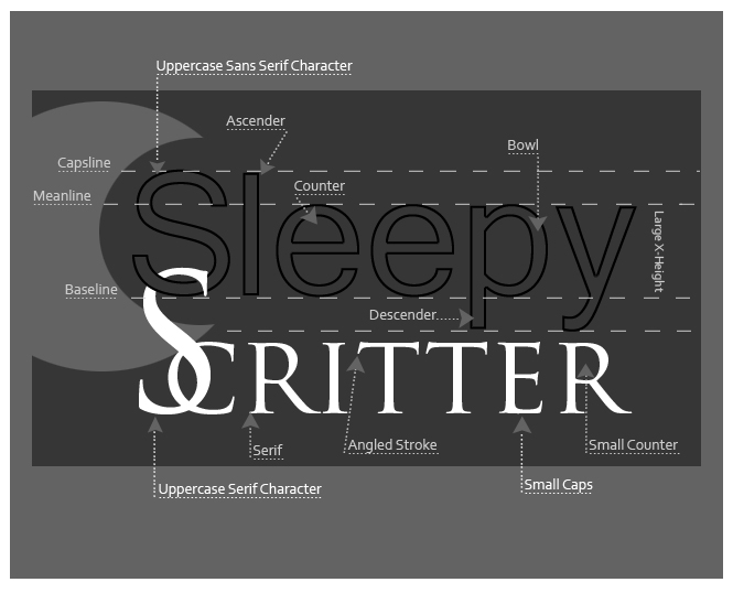 |
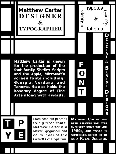
Typography Elements & DesignThe first two diagrams use sans serif and serif font to show the parts by name for the typefaces as well as their placement. While working on this project I wanted to add some interest by playing with the juxtaposition and shades of grey. The last piece is a grid design done in Adobe iLLustrator. The project was to feature one designer's typeface collection. As you will see I chose Matthew Carter's font designs for this project. I really enjoy working with type and layout, and I hope to provide more examples of my take on this art form in the future. | 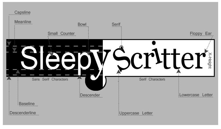 |
 |
Typography LinksType & iLLustrationLogos & Process About Me My linkedin Contact email Back to Top |
Web site Design and content © Sandy Lynn Path
 |