SURREAL SEATTLE: Bottle Label
|
Cross Platform Design
|
 |
 |
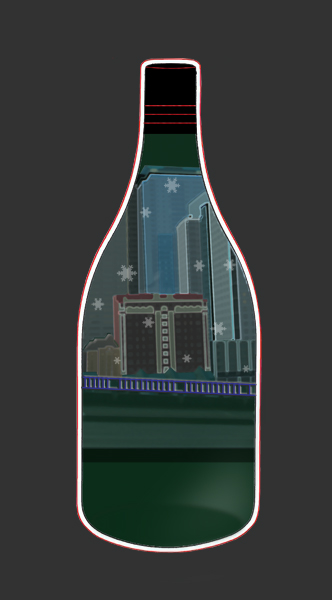 |
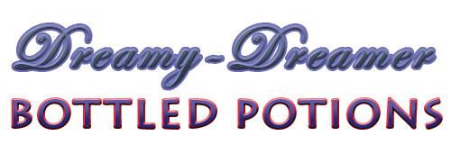
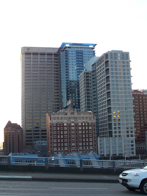
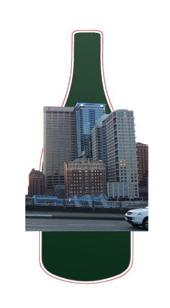
Because this project is for ongoing experience and practice I gave the label a fictitious company name. The type layout are based on some techniques I learned while studying graphic design. I added various elements to my original photo including the bottle die cut I found from online sources. |
Experience Gained doing Project
|
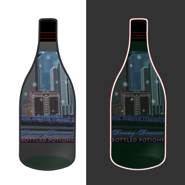
Final result finished by editing photos in Adobe Photoshop; use of shape tools as well as applying layer adjustments. The type design was created in Adobe iLLustrator with a lowered resolution applied. Some of the line work was also done in iLLustrator for a sharper graphic appearance and layered over a slightly softer, blurred image. Back to Top |
|
Web site Design and content © Sandy Lynn Path  |